CBN
CBN Animation: From Superbook® Animated Series to Animation Studio
Project Overview:
Develop a cohesive visual system that would energize the brand, unify platforms, and better connect with today’s families, educators, and ministry partners.
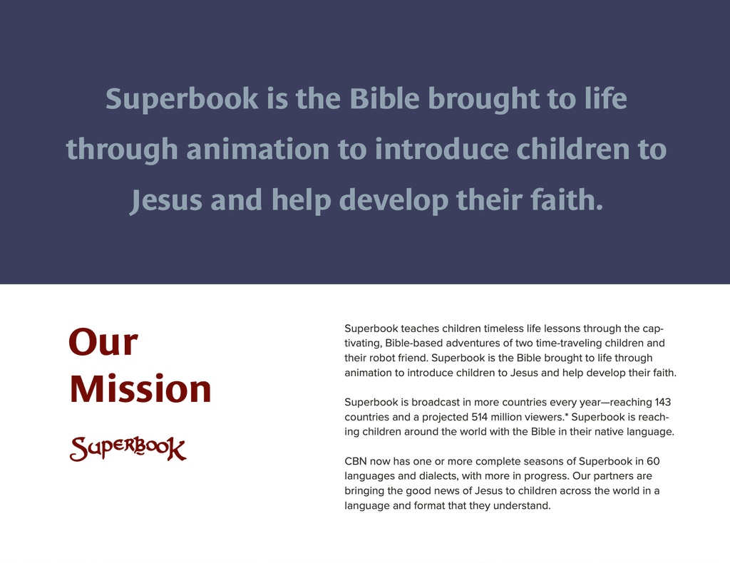
I partnered closely with the Head of Marketing and Development to refresh and unify the Superbook brand across global platforms. My role focused on creating a new visual identity that would resonate beyond the animated series—developing a brand guide, updated logo system, color palette, and typography that brought consistency and energy to both the show and the Superbook Bible App. I also defined an art style for promotional illustrations that visually connected to the Bible stories while engaging a broader, more diverse audience worldwide.
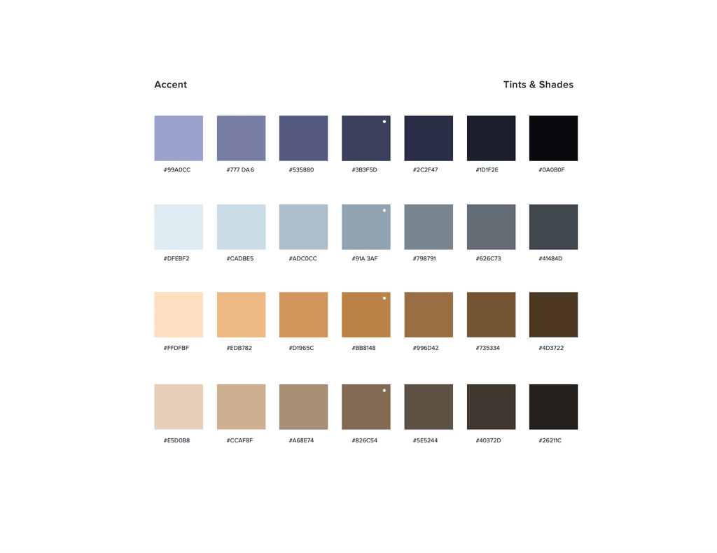
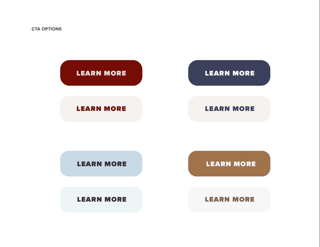
Brand Style Guide: Colors
Brand Style Guide
My Role : Art Director, Brand Strategy, Brand Design, Style Guide
Discovery & Brand Alignment
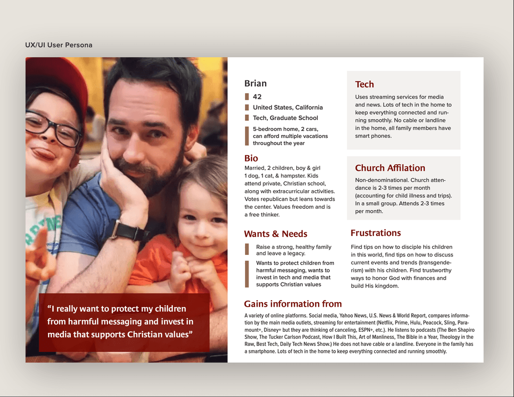
Partnered with the Head of Marketing and Development to define key audiences, outline ministry goals, and assess existing brand equity. We clarified how the new ministry brand would align with, but remain distinct from, the animated series.
Palette & Typography Development
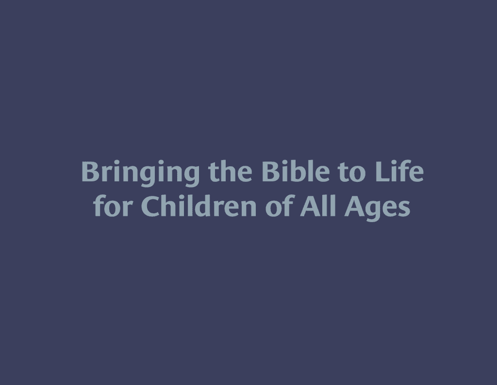
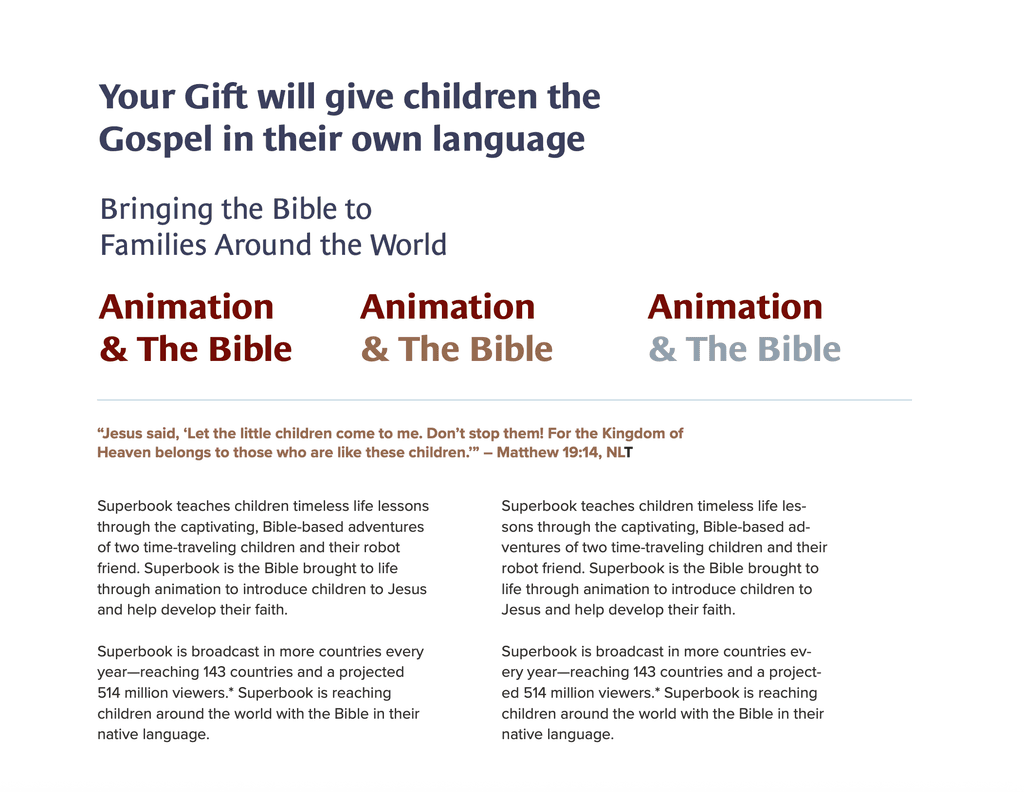
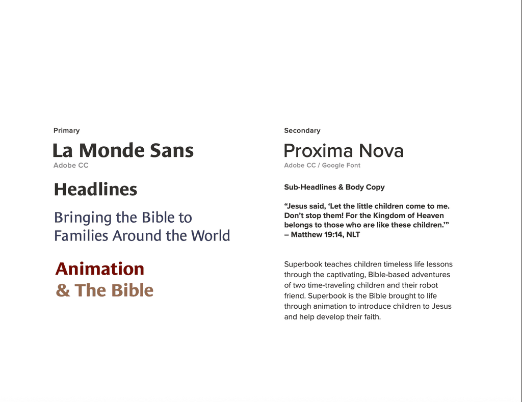
Explored color and typography systems that could flex across platforms—bright and friendly for children, but also grounded and reverent for adult-facing materials. Fonts were chosen to balance readability with a sense of trust and spiritual authority.
Visual Style Definition
Built a visual hierarchy and promotional art style that felt connected to the show’s energy, while allowing space for storytelling that extended into real-life application. This gave the brand room to speak effectively to a multi-generational audience.
Brand Guide Creation & Asset Rollout
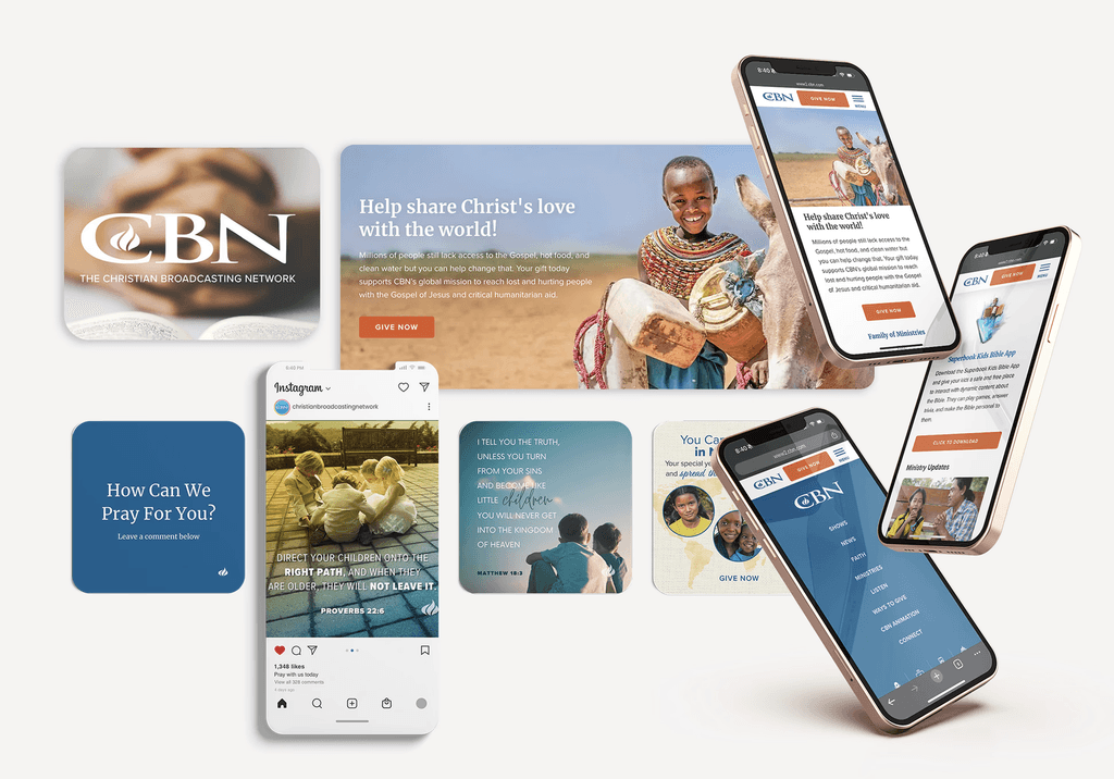
Documented the full brand system—including logo variations, color usage, type rules, imagery guidelines, and use cases—so internal and global teams could implement the new identity consistently across all platforms.
Brand Style Guide
Brand Style Guide
Brand Style Guide
Brand Style Guide
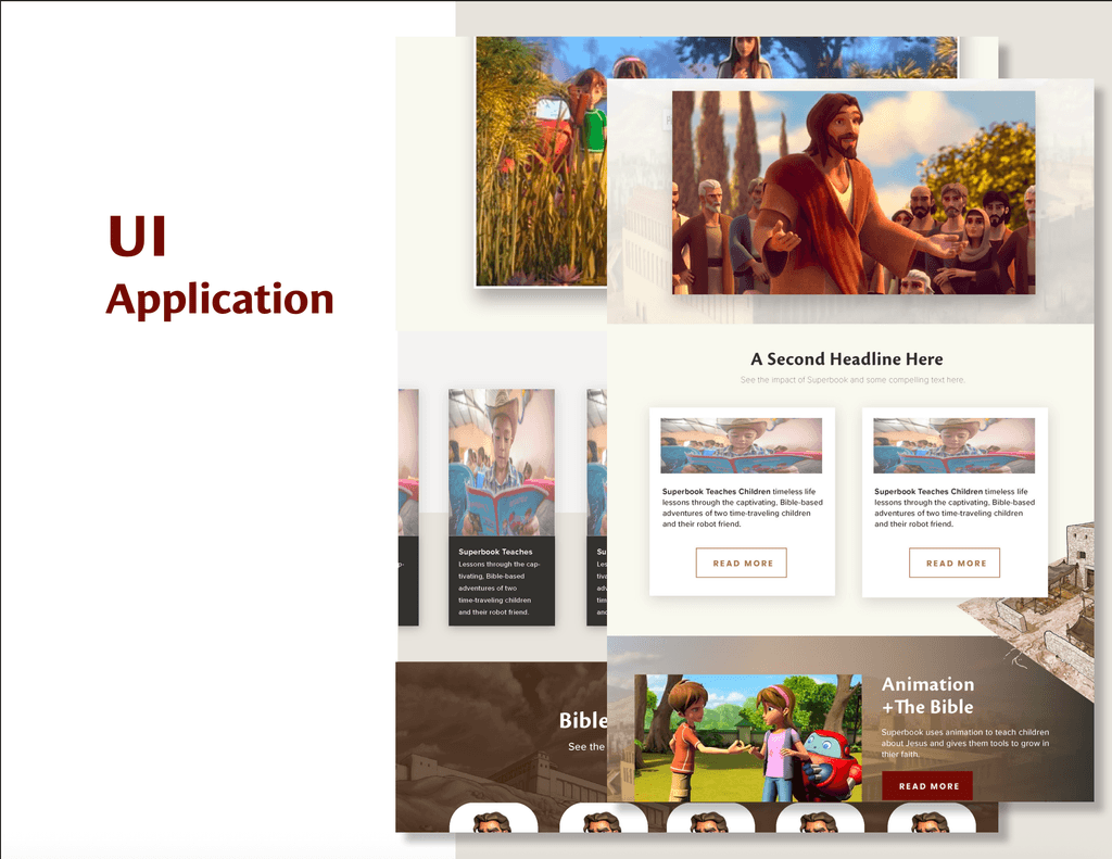
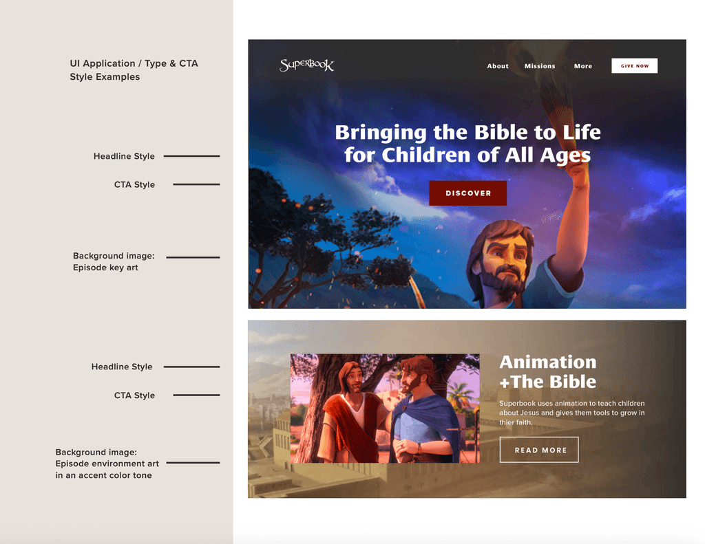
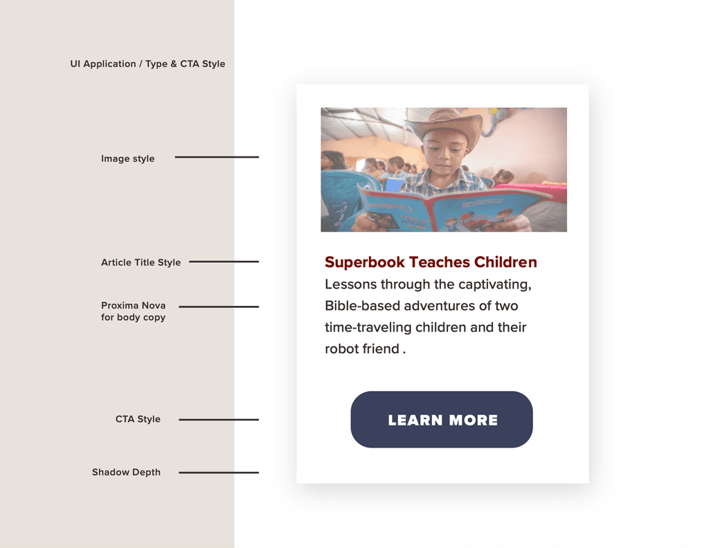
UI Tool Kit
Brand Style Guide: Personas
UI Tool Kit
UI Tool Kit

Challenge 1: Evolving the Color Palette for Dual Audiences
Superbook’s original color palette was vibrant and kid-centric—perfect for the animated show, but limiting when applied to broader ministry efforts. As the brand expanded to include content for parents, churches, and global partners, the visual system needed to mature while still feeling connected to its core audience.
Solution:
I carefully evolved the color palette to maintain its playful roots for children’s media while introducing new tones that communicated trust, tradition, and spiritual depth. The result was a versatile palette that supported both the animated series and the growing ministry’s outreach materials.
Challenge 2: Establishing a Distinct Identity for Superbook Ministry
With Superbook growing beyond a kids’ show into a full-scale discipleship and outreach ministry, there was a need to create a standalone yet cohesive visual identity that spoke to parents, church leaders, and ministry partners without losing the connection to the original brand.
Solution:
I created a new look and feel for the Superbook ministry that honored the legacy of the biblical stories while positioning the brand as a credible, faith-forward tool for spiritual growth. This included selecting modern but timeless fonts, designing flexible layouts, and updating logo treatments to differentiate ministry communications from children’s media.