CBN
Creative Direction for CBN Brand, elevating a legacy brand.

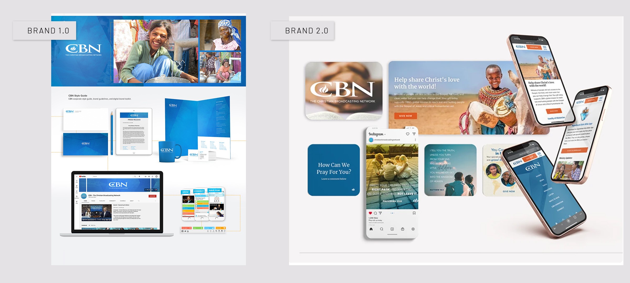
CBN Rebrand:
Art Director, UX Design, Brand Design, Style Guides, Design System, Web, Email, Social
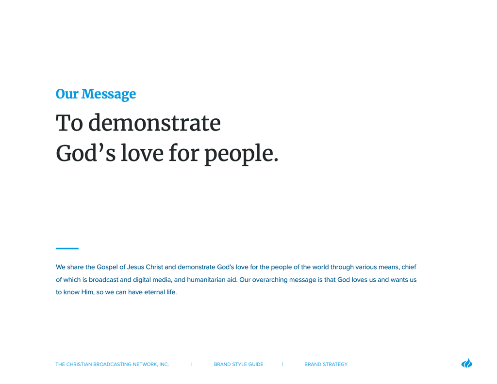
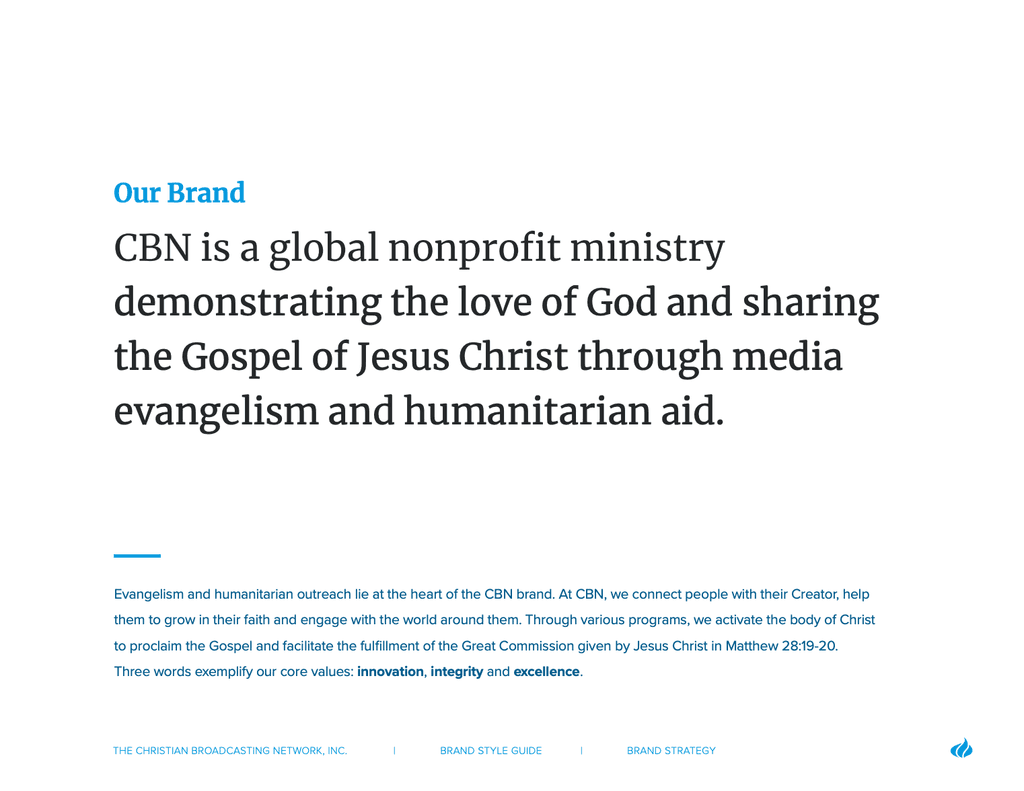
As Creative Director at CBN, I led the corporate rebrand, developing Brand Guidelines and a design system to unify teams across UX/UI, marketing, and development. By collaborating closely with key stakeholders, I ensured alignment and evolved CBN’s visual and digital identity to better connect with its global audience.
For a deeper look into my approach to creative leadership and collaboration, read my article on design leadership.
Challenges & Solutions
Balancing Stakeholder Expectations:
One significant challenge was managing a wide range of stakeholder perspectives—often deeply tied to the legacy of the brand. At times, personal preferences conflicted with research findings or modern best practices. I navigated these moments by leading with empathy, focusing conversations on user needs, and consistently returning to project objectives to unify the group around a common vision.
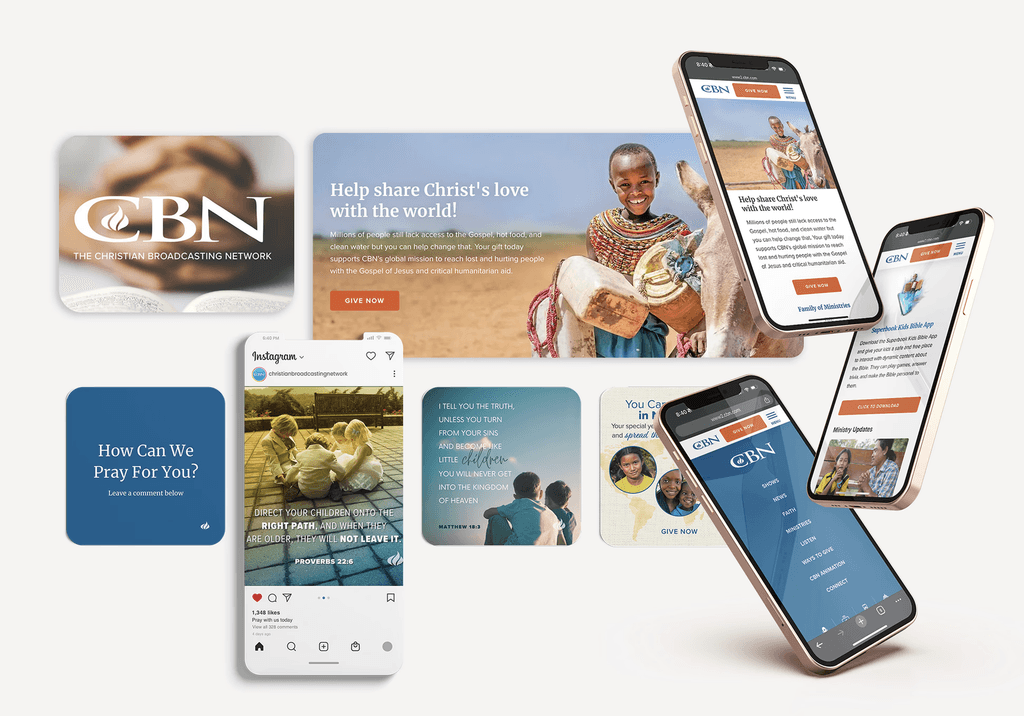
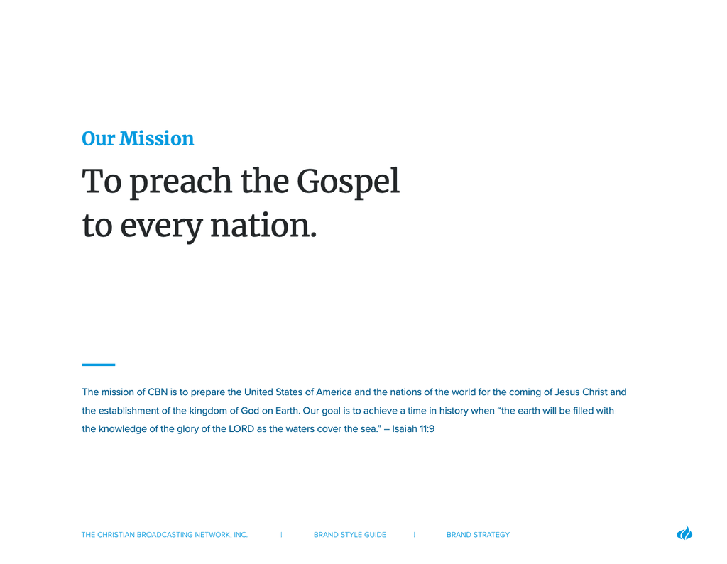
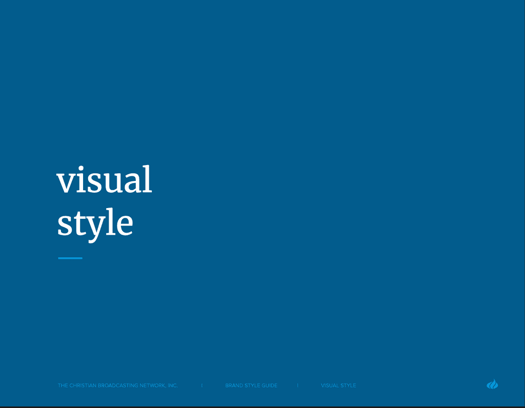
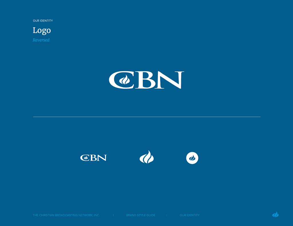
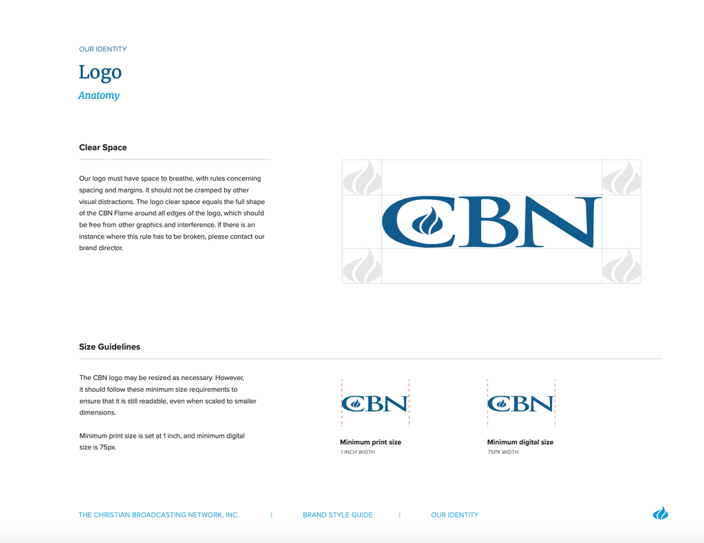
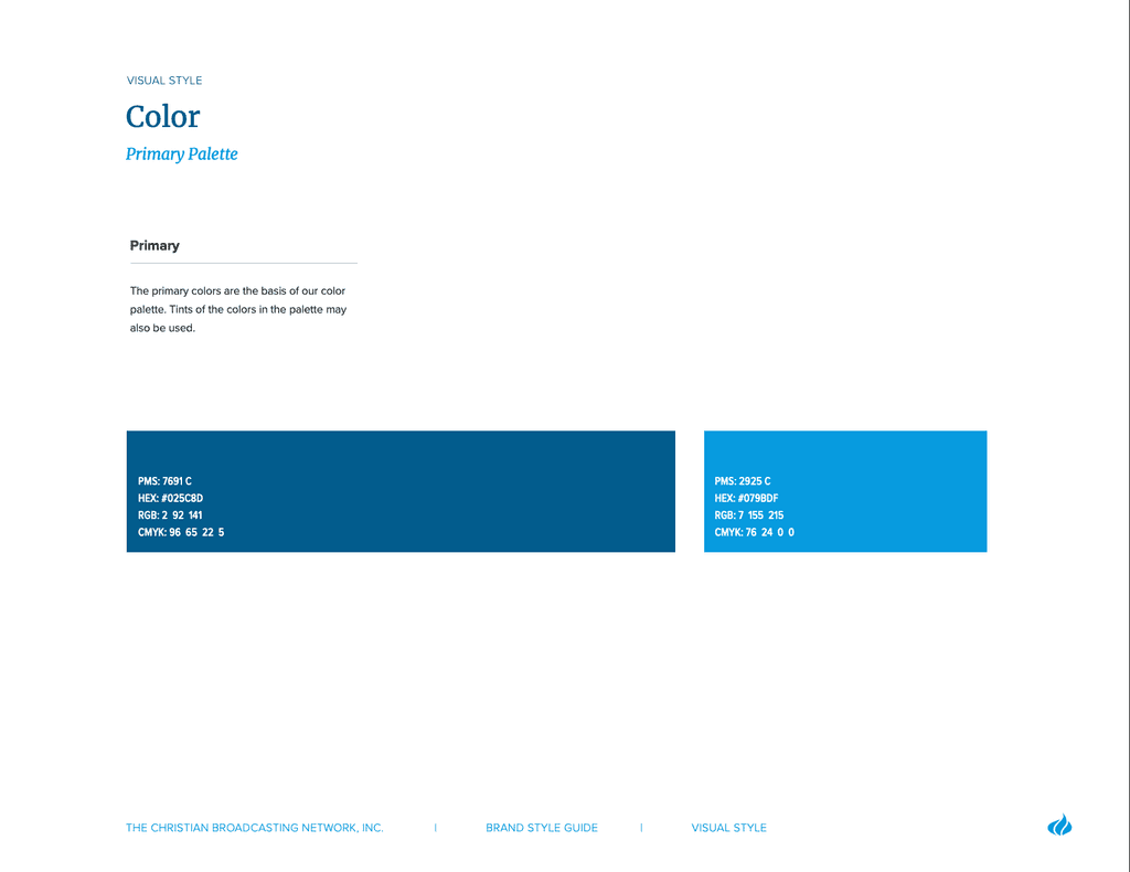
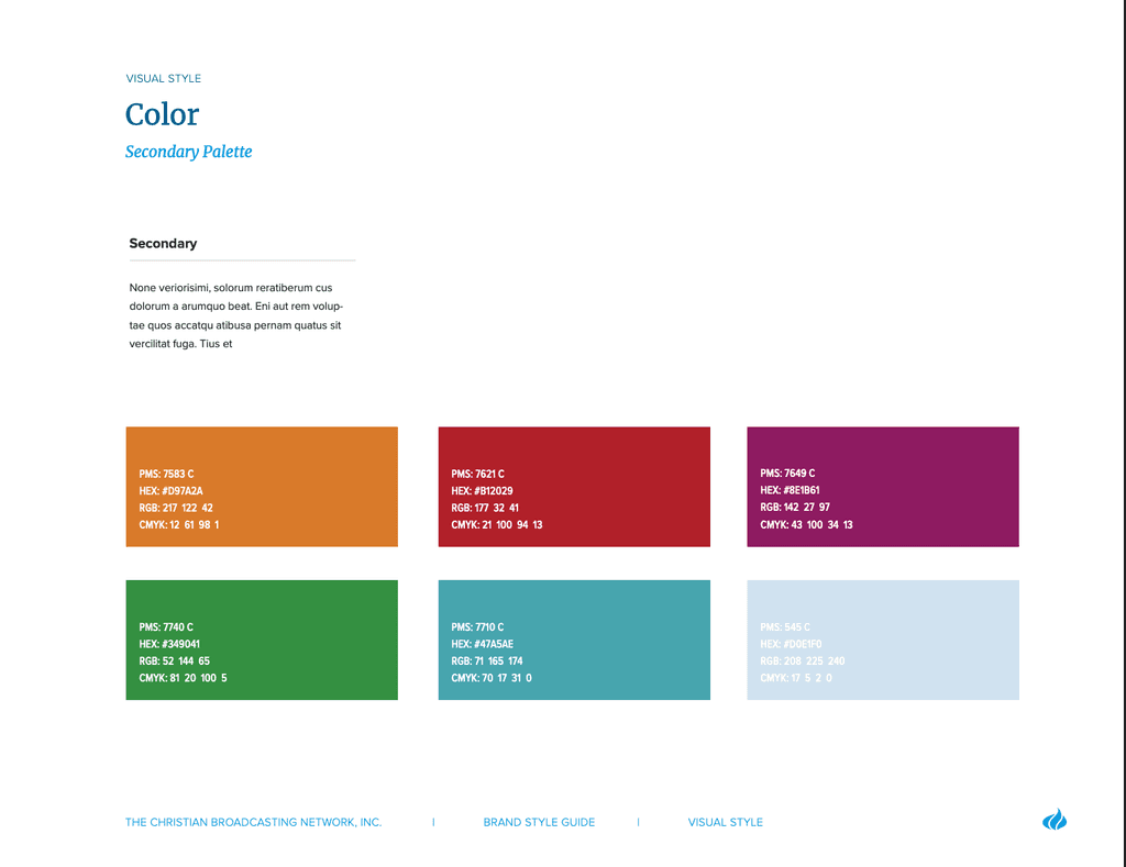
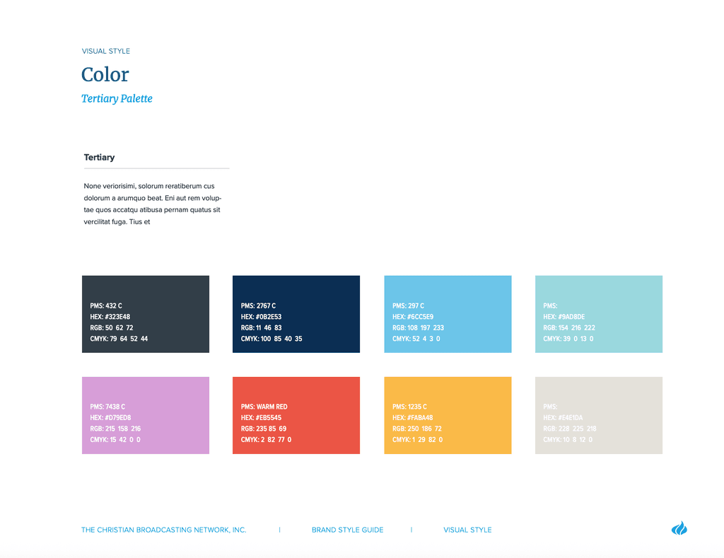
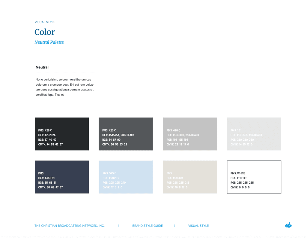
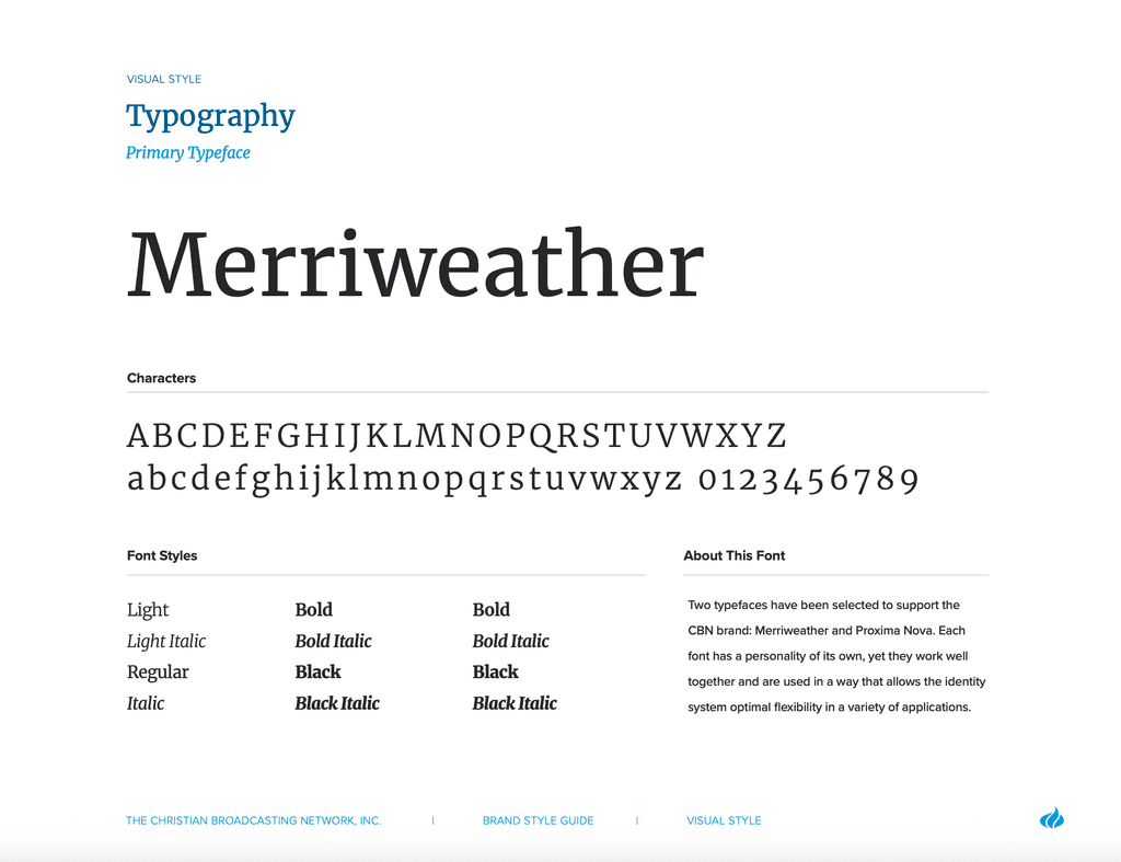
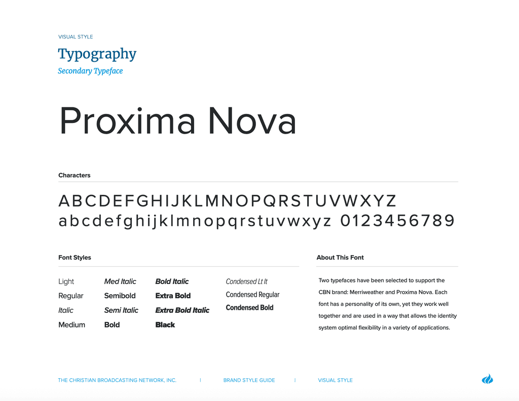
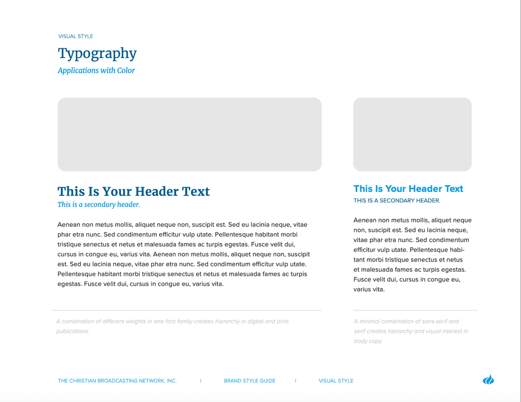
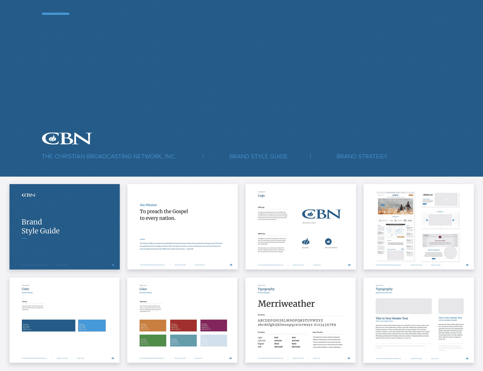
Brand Guidelines & Visual Style
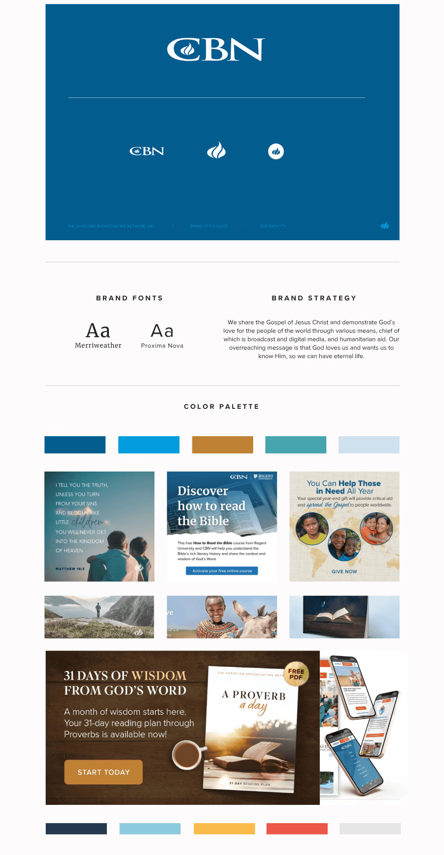
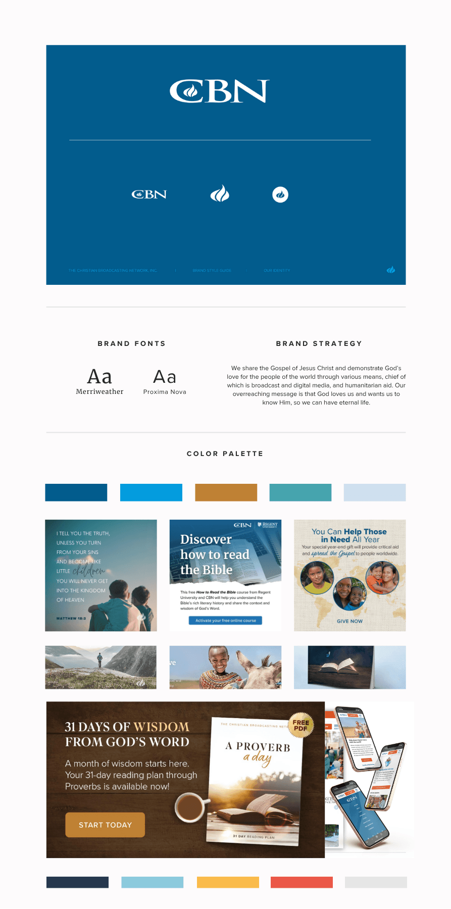
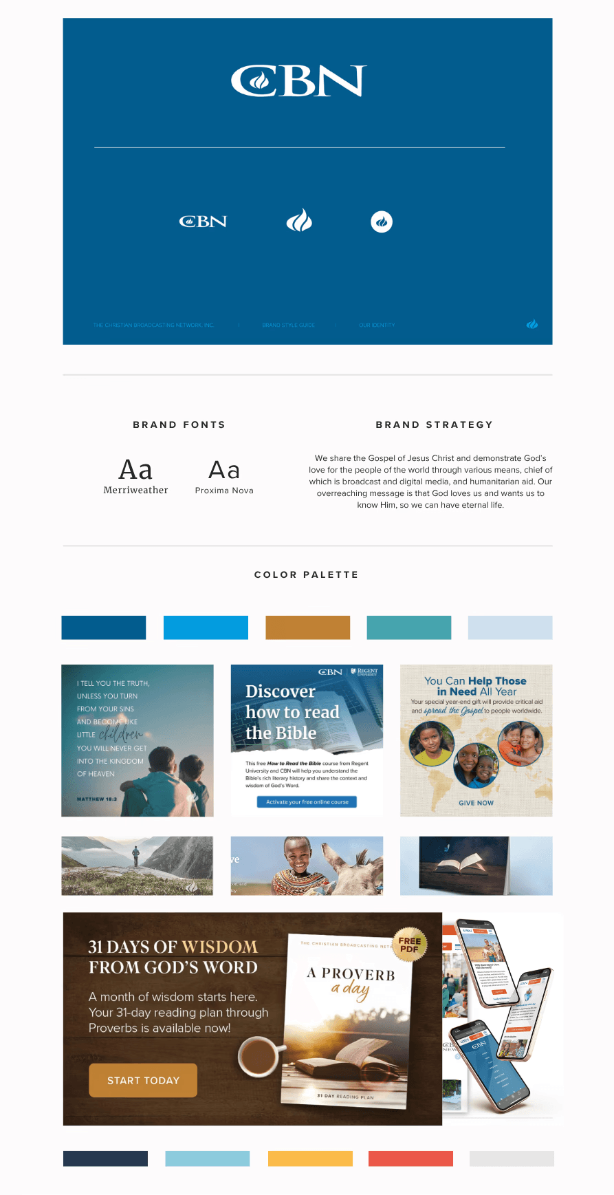
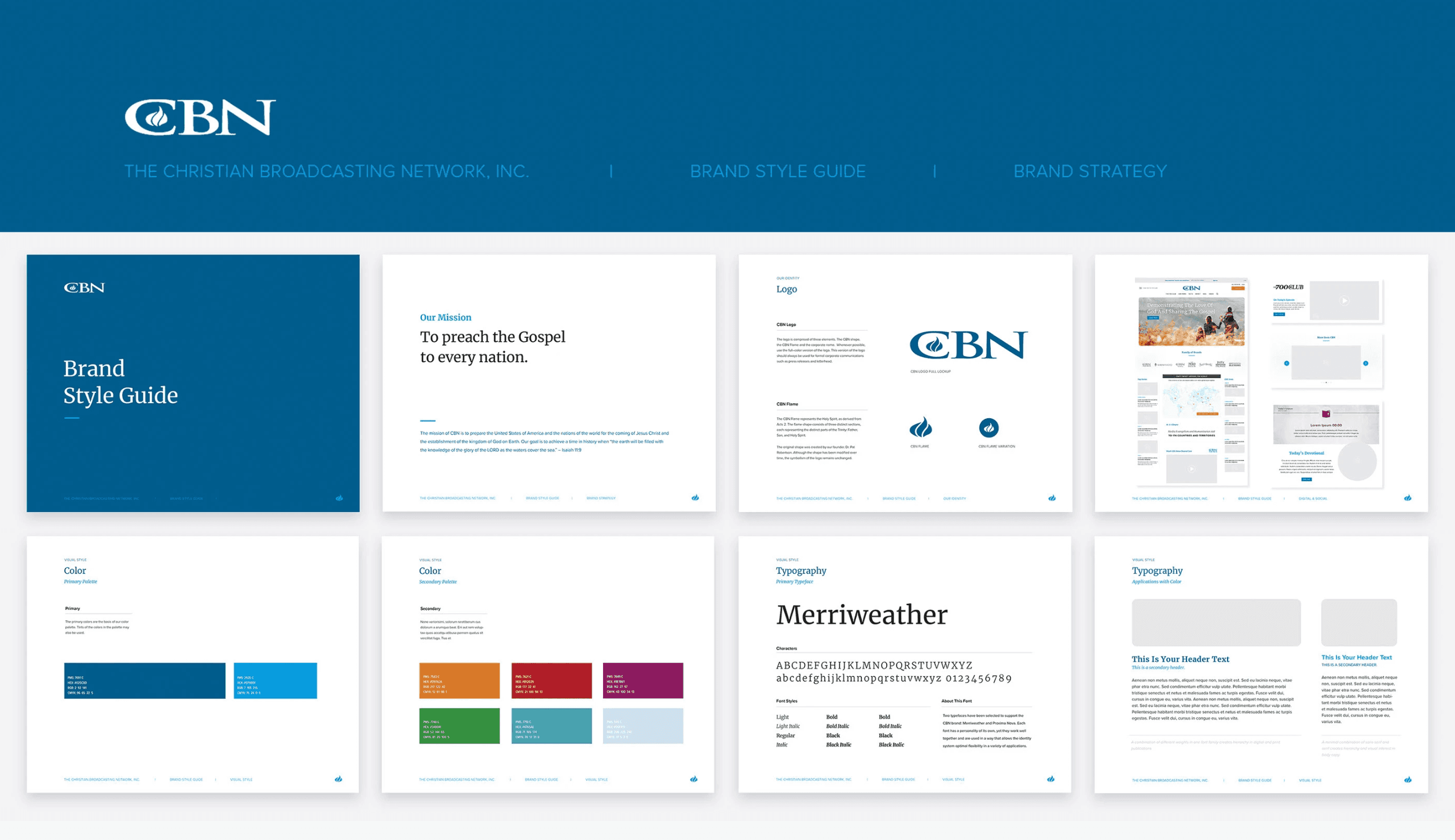
Corporate Style Guide
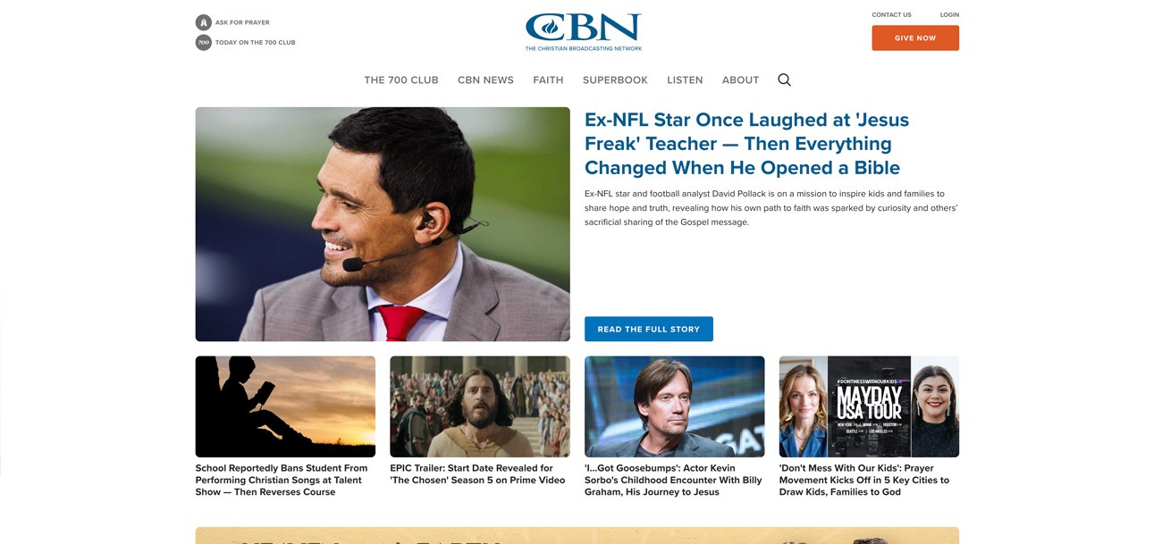
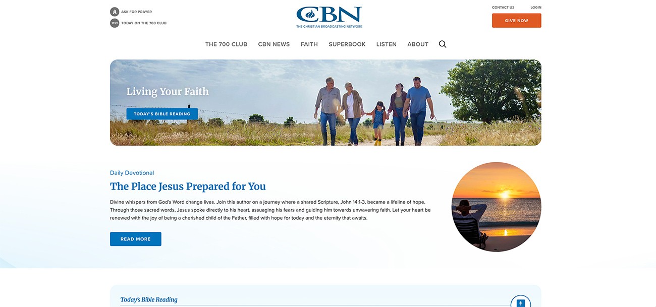
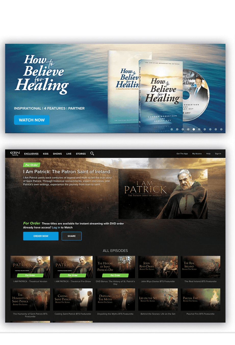
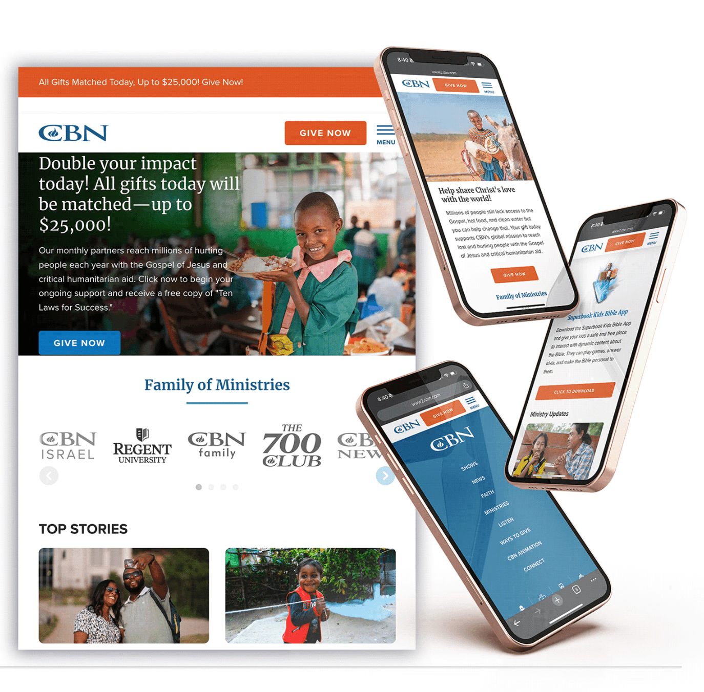
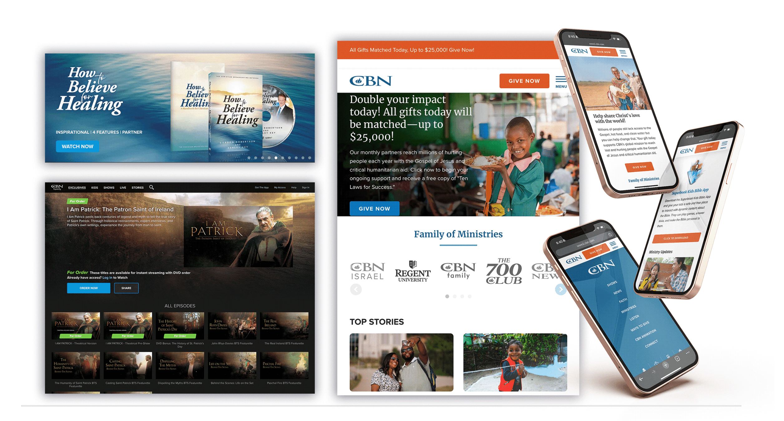
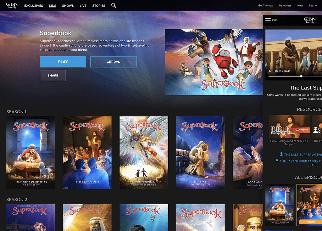
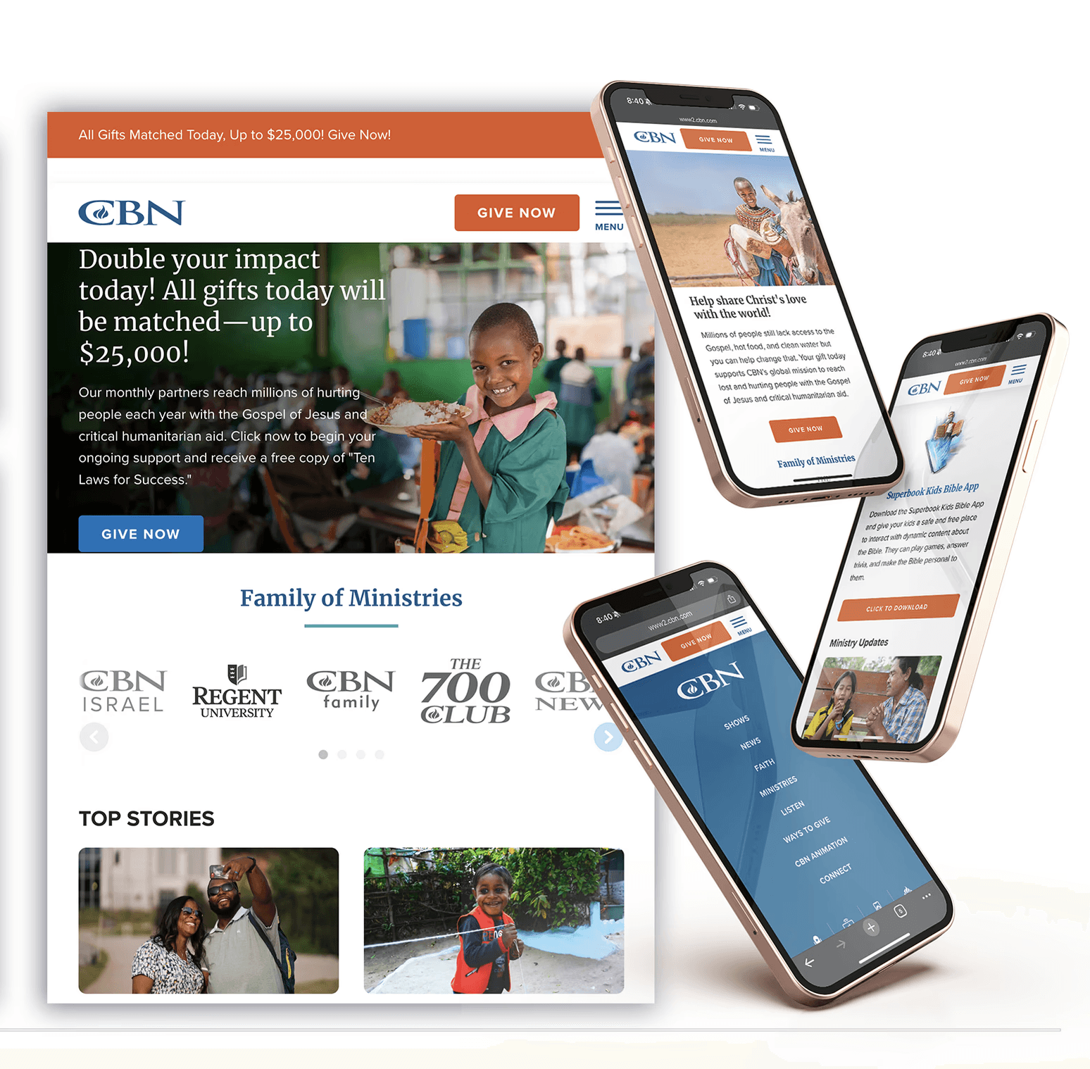
CBN.COM UX Design & Toolkit
CBN.COM UX Design & Toolkit
CBN.COM UX Design & Toolkit
CBN.COM UX Design & Toolkit
CBN.COM UX Design & Toolkit
CBN.COM UX Design & Toolkit
CBN.COM UX Design & Toolkit
CBN.COM UX Design & Toolkit
CBN.COM UX Design & Toolkit
CBN.COM UX Design & Toolkit
CBN.COM UX Design & Toolkit
CBN.COM UX Design & Toolkit
CBN.COM UX Design & Toolkit
CBN.COM UX Design & Toolkit
CBN.COM UX Design & Toolkit
CBN.COM UX Design & Toolkit
Process
Art Director, UX Design, Brand Design, Style Guides, Design System
Research & Planning
Conducted in-depth research to understand user needs and brand goals, laying the foundation for CBN.com’s rebrand strategy and style guide development.
Design & Prototyping
Created and iterated on design concepts, developing prototypes to visualize the updated style guide with new colors, fonts, and layouts for CBN.com.
Implementation
Applied the new style guide across the CBN.com platform, ensuring consistency in colors, typography, and design elements throughout the site.
Testing & Optimization
Conducted user testing and analyzed data to refine design elements, optimizing the site’s performance and user experience based on real-time feedback.
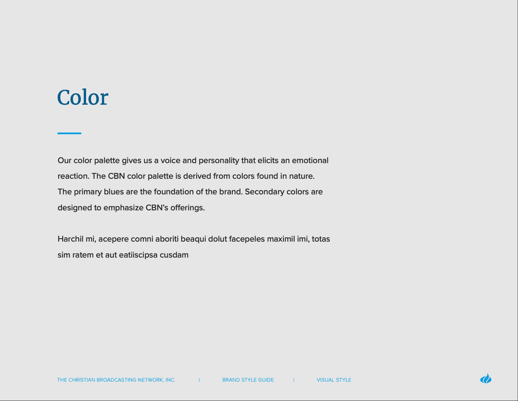
Color Changes and Implementation:
What does this blue mean in the context of the brand’s pillars, mission, and history?
How has it shaped audience perception over the last 60 years?
And most importantly—what does the next chapter look like?
Through color testing, accessibility evaluations, and alignment with legacy visuals, we arrived at a refined shade of blue that preserved brand recognition while dramatically improving usability across digital platforms. Once the primary color was finalized, the rest of the color palette fell into place naturally, creating harmony across the design system.